
In order to make FastFileTransfer’s icon better fit Android’s design patterns, I am planning to add a new icon to the app. I have thus created a set of new icons that you can see in the image below.
In order to vote for an icon, please select one of the options in the list below and press “Vote”.
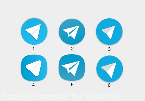
Which icon do you like best? Poll ended.
If you have any remarks concerning a particular icon, please feel free to post a comment below!
(All icons (c) Florian Draschbacher)
All these icons look *a lot* like Telegram's icon, down to the choice of color. Have you considered any larger changes to avoid brand confusion?
In my opinion, this is caused by both using the same metaphor. I came up with the app's color theme and icon design before I found about telegram. I am aware they look similar, but I just could not come up with a better metaphor. Also, I do think that especially the material-inspired icons above (1,3,4,6) look different than telegram's icons.
If you have any additional icon or metaphor ideas, please let me know!
I like the paper plane metaphor and still think you should stick with it. Maybe try a different color or orientation? Or better yet, just have a paper plane without any surrounding bubble. I'm not sure how it would look as an icon, but a flying paper plane (with motion trails) might also be a good idea.
Oh. You should show existing icon with proposed icons.
The original icon can be seen at the top here.
yup The original icon!
Just want to check. Have you discontinued FastFileTransfer app from Google Playstore. I am not able to find app in Playstore.
It will be available again in 2017.